I'm excited to announce that my new personal website is now live! 🎉 → jmswrnr.com ♥ Built using: @sanity_io | @threejs_org | @zeithq #Now + #NextJS


Creative Web Dev Techniques of 2024
Introduction
I launched this blog website back in March 2020, that's four years already! It has been my place to freely experiment with new concepts and cutting-edge web tech.
It's built with React & Next.js and over the years a lot has changed. It has seen many design iterations, some substantial technical refactors, performance optimizations, and accessibility improvements.
I have just finished my latest batch of updates, including a migration to the Next.js App Router. Let's take a look at what I've learned and some creative web dev techniques that you can implement!
You can see a glimpse of the original design from launch day in this Tweet:
Favicons
Favorite icons (favicon) were originally added in IE5 to be used just for bookmarks. But now in 2024, favicons are displayed in browser tabs, search results, and embeds; nearly every website still has a favicon today. However, they're not often utilized in web design, and they should be!
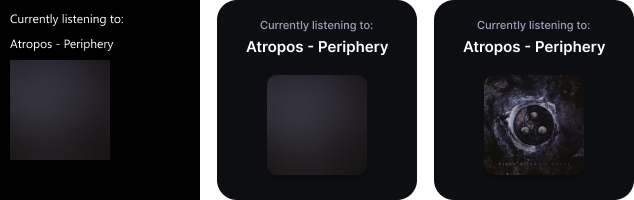
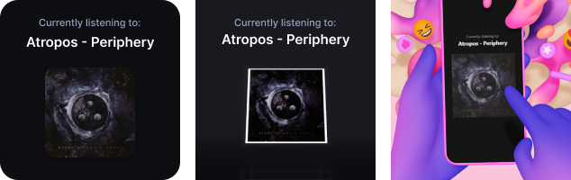
For a long time, I've used SVGs or icon fonts for brand icons in web design, it gives you the freedom to nicely align the icon style with the design of the page:
But this has a noticeable downside for the user. If someone is familiar with the brand, they will instinctively be better at recognizing it from how they usually see the icon. That's where favicons come into play:
Where design permits, I now lean towards using favicons as a source for all brand or website icons. I use them on this website for the follow & share buttons, and also display them alongside external links in my blog posts!
I've found favicons to have a long list of pros, they're:
- Always up to date
- Designed for a small render resolution
- Designed to contrast over any color background (usually)
- Obtainable for nearly every website at
/favicon.icoor from search engines
And since using them, I've been able to avoid:
- Needing to manually resize icons to visually balance them with others
- The limitation of single-color rendering when using icon fonts
- Manually fetching and organizing brand SVGs
- Dealing with missing brand icons from icon collections
On this blog, I've created an API route to process, cache, and securely serve the favicons. Be mindful of security when creating a route like that, I have another post explaining articlehow to protect a Next.js API route.
Progressive 3D Enhancement
This is something I've put a lot of effort into for my websites. It's crucial for optimal performance and accessibility when delivering interactive 3D experiences.
But what does it mean exactly? it's a strategy that prioritizes a content-first experience, allowing everyone to access the basic content of a web page.
A slower connection, older device, or user preferences should not prevent someone from accessing the content in a basic form!
After loading the HTML content, the points of enhancement for a simple web page would look like:
- CSS loaded -> apply custom styles
- Fonts loaded -> swap to custom fonts
- JS loaded -> apply client interactions
- Images loaded -> display images
No enhancement should be required to view the page, so no matter where the enhancements stop, the user can still at least access the content.
For 3D web experiences, I continue enhancing:
- 3D Motion Graphics
- If the user
prefers-reduced-motionor has opted out of 3D -> ignore the enhancement - Load 3D JS & content -> upgrade content with 3D graphics
- 3D Interactive Experience
- If the user hasn't opted into the interactive experience -> ignore the enhancement
- Load 3D experience JS & content -> upgrade 3D graphics into interactive experience, such as an explorable environment, guided story, etc.
With this approach, it doesn't matter if you're exploring the content in a virtual 3D world or using a screen reader, the same content is available.
I'm currently creating a new 3D experience for this website which utilizes this exact enhancement strategy!
Structured Content
I've built a few personal websites before this one. Something I wanted to dedicate more focus on this time was content management.
After comparing numerous options, one that stuck out to me at the time of dev was Sanity, their approach to content aligned with the way I want to build websites and 3D experiences. While there are many options for content management, here are the main reasons for my preference:
- Open-source editor & close-source platform. I want to maintain the least amount of tech possible here. I can customize the content editor, and they take care of the things I don't want to deal with; database storage, real-time collaboration servers, content querying, and delivery.
- Content is Data. The headless CMS pattern is common these days, the editing experience and storage are separated from the website allowing it to scale independently and for the content to be consumed by different applications. But Sanity went beyond that with the concept of Structured Content, it doesn't spit out HTML from a rich text editor, it gives you content in an organized JSON format that you can present how you want to. This is invaluable for hybrid 3D experiences, without being limited to a specific format, both webpages and 3D experiences can present the same content however they want to, making progressive enhancement a breeze.
- GROQ is just what it needs to be. GraphQL has never really stuck with me for fetching content. I do believe it has a place in larger applications, but I just want to query a couple of blog posts and that's where GROQ comes in. While not a 1:1 comparison, GROQ is a query language for JSON, Sanity uses it with its API to query content. The syntax is refreshingly minimal but allows for powerful filtering and data transformation.
Writing Tests as a Solo Dev
Why write tests if you're the only developer and user of the code? Refactors.
Sometimes you need to update some code where issues could easily go unnoticed. A perfect example of this is a <Metadata/> React component I created when building this blog. I wanted meta tags for my blog posts in Next.js: Twitter cards, Open Graph data, and JSON-LD.
The implementation is straightforward work from a technical perspective, but I still dropped in Vitest and wrote tests for complete coverage. Metadata tags were something I didn't want to break, they're important for SEO and social embeds.
Fast forward to the latest refactor; migrating to Next.js App Router. Next.js now has a Metadata API and during my migration, I switched everything I could to that, the less code I need to maintain the better.
I thought everything was fine until those tests kicked in. Missing data, and incorrect values, it caught a couple of major issues. This saved me from shipping broken metadata, and the pain of fixing it in the future when it's eventually noticed.
Write tests!
Next.js App Router
This blog has been through a lot. From ZEIT to Vercel. From React Class Components to Hooks. From Next.js getInitialProps to getStaticProps/getServerSideProps, and now to Next.js App Router with React Server Components.
All pages on this website have now been migrated to routes in the App Router. I've been rather hesitant to migrate, I'm a bit fatigued by the constant refactors to new complex patterns for seemingly minor improvements, but I'm glad I did.
One annoyance I often had when previously building Next.js applications was the lack of granular data fetching and caching. Want some data fetched to display on every page? well you couldn't fetch that in _app.js. You could add it into the props of every page but then it could be caught in the page cache, so if you're using static props that's an issue because you can't mix static and server-side props. You could also postpone it to a client fetch request but then you need to set up API routes and the layout could shift.
App Router tackles this issue with:
- Nested layouts that can each fetch data to be used for rendering both server and client components.
All without writing an API route, now that's pretty nice!
We can migrate any components that don't need client interactions to be rendered only on the server and cached. And the client doesn't need to bother rendering them again.
I find that working with Next.js, the framework pushes us to follow best practices, and that's no different here. The server-first approach helps to highlight React components that unnecessarily rely on client-side JS logic.
Safari Can't Handle Grids
Since the introduction of CSS grids, it has been my go-to choice when coding 2D layouts. But when testing the layout in Safari it has usually been rendered unexpectedly. I've seen everything from incorrect spacing and overlapping items to items not even rendering on the screen.
No matter how many CSS properties I tweak, I always end up frustratingly refactoring most complex 2D grids into nested flex boxes.
I'm now unfortunately hesitant to utilize CSS grids for websites that will be displayed in Safari. Make sure you test complex grid layouts early across major browsers before committing to them.
CSS Tricks
Here are some CSS techniques that I've been using recently:
color-mix(in srgb, var(--color-red) 80%, transparent);Add transparency to color variable using color-mix()
.grid-table {
  display: grid;
  grid-auto-columns: repeat(5, min-content);
}

.row {
  display: grid;
  grid-template-columns: subgrid;
  grid-column: 1 / -1;
}
Use Subgrid to access the tracks of a grid without being a direct child of the grid element. The subgrid value allows a grid element to use the tracks defined on the parent.
This is helpful if you want to wrap multiple grid items, for example a row wrapping multiple cells in a table.
.GridColumn {
  isolation: isolate;
  pointer-events: none;
}

.GridColumn > * {
  pointer-events: initial;
}

.GridColumn:hover {
  z-index: 1;
}

.GridColumn:focus-within {
  z-index: 2;
}
Stacking contexts can be a real pain and can quickly become overly complex.
On this blog there are multiple columns, each of which have child elements that occasionally want to render over the others.
For example, some blog posts have Code Sandbox embeds that expand over the blog sidebar, but if you hover or focus within the blog sidebar it should render above the embed and vice versa. Also, some columns have floating menus that overlap the other columns.
With this CSS, each column creates a new stacking context using the isolation property. If you hover a column it increases the layering priority, and if a column contains a focused element that takes higher priority.
Also, the pointer events are disabled on columns, and reset to initial defaults on all direct column children, this prevents any column whitespace from triggering the :hover style.
I recommend checking out What The Heck, z-index?? for further reading.
.element-wrapper {
  container-type: inline-size;
}

.element {
  background: blue;
}

@container (max-width: 360px) {
  .element {
    background: red;
    width: 50cqw;
  }
}
Wrap elements in a query container and responsively adjust styles based on the element size instead of the commonly used viewport size!
You can also use the container query length units like cqw to style child elements using the parent container size.
On this website, I wrap the page contents in a query container. So when deeply nested components want to overflow their parent to expand to the full page width (not viewport) I can calculate that using 100cqw!
RSS Feeds
I don't often hear about RSS feeds these days, but people still use them!
Not everyone is active on social media platforms, and with questionable modern social algorithms often preferring posts without external links or with short-form video content, staying up to date with content can be difficult.
That's where RSS feeds come in handy, a standardized feed of content that people can subscribe to using their preferred application.
They're also quite straightforward to implement, I've created a Next.js route that fetches my latest list of blog posts and formats it into XML using this RSS module.
Here's my website's RSS feed, if you're curious what the data looks like.
Module Shoutouts
Here are some modules I've enjoyed using that are still in use on this website today:
- Floating UI - previously known as Popper, a great library for creating tooltips and popups, I use it here for the settings and share menus.
- Radix UI - a wonderful collection of UI primitives that can be imported individually to a project, I'm using the ScrollArea component for the homepage blog list and the blog post sidebar navigation.
- Zustand - a simple state-management solution with support for React hooks, I use it here to provide the user settings state to React components.
- jose - a module that I use for signing and verifying JSON Web Tokens, with support for running inside Vercel's Edge runtime, I use it to sign and verify tokens for articlesecuring my API endpoints.
Conclusion
That's all that comes to mind from the last few months of web dev. Hopefully, you can take something useful away from this post!
What do you think of this website's new design? Have I missed out on anything cool tech recently? let me know on Twitter!